Mr. Wanyama Ogutu is a scholar in the Master of…
Mental Laxity and an Overdependence on Technology Devices
An admirable car in the showroom draws attention, but it serves no purpose if it is on display. Even though it is attractive and perfectly constructed with tonnes of gold and silver, it stalls at the car yard. I learned from a mechanic that a good car has a perfect engine. The mechanic ensures that the vehicle’s qualities are considered in the assembly process. An engine comprises fitting pistons and is clothed with attractive tonnes of metal. The car will not move if the right axle is placed in a socket without space, reducing it to motionless tonnes of metal. However, for the vehicle to move, the axle and socket in the engine must shake to allow the movement of the tonnes of metal. The mechanic details how the pistons of the engine knock, open the cylinder, and move on the axle in the engine socket, leading to the motion of the lifeless tonnes of metal.
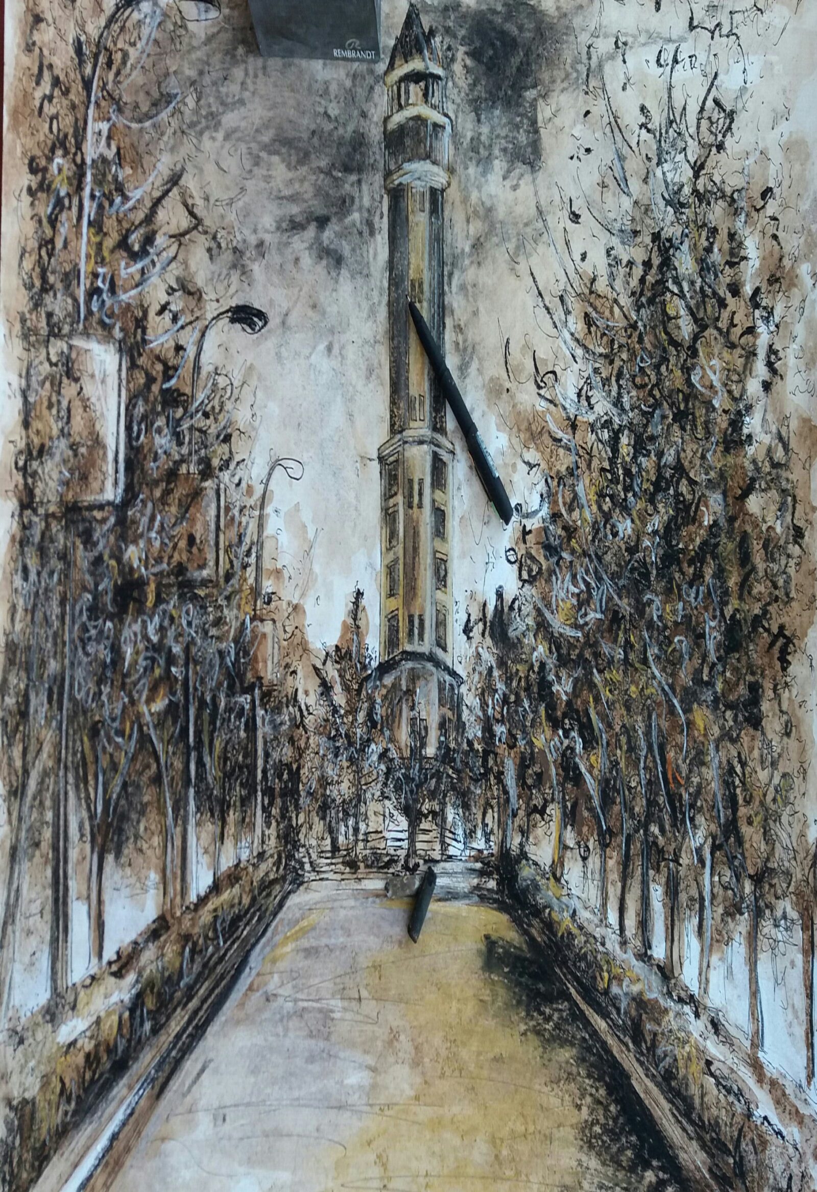
A perfect design is well executed by adequately considering the elements and principles of art and design. A critical examination of the design displays an excellent and attractive design in the eyes of the viewer; however, design critics have complained that such designs tend to be static and restless. The analogy of a car is an excellent example of a perfect but lifeless design. Old masters such as Jan Vermeer, Peter Paul Rubens, and Rembrandt van Rijn understood the analogy of the design of a good car. If you examine the masters’ painting designs, they are perfect and, at the same time, eye-catching to the admirers in galleries and exhibition halls at prestigious museums. Today, the masters’ painting designs earn applause from art historians, design critics, art schools, galleries, and exhibition halls.

There is an article written by a master scholar of art with profound experience, understanding, and knowledge as a design teacher and a practising artist for many years. It is neither meant to criticise the realists nor photorealist designers nor to look down upon the perfectionist or good-standard artwork. The article sheds light on the laxity of the artistic mind and the illusion of perfect designs due to over-dependence on technology devices. A design lecturer at Kenyatta University and a longtime graphic design practitioner, he always emphasises that a designer of a higher level should not compete with camera devices but instead challenge their inherent creativity and imagination. “Over the years, I have been disgusted when I see my students, colleagues, and artists struggling to get the perfect piece of design.” He continues. “They are depriving their creativity and imagination by copy-cutting, making shorts, and trying to meet the camera’s standard. Such design is perfect, excellent, and amazing work at face value.” He concludes that the short-cut process inhibits the designer’s creativity. According to art therapists and psychologists, realism and photorealism are manifestations of the level of artistic development stage for any designer. It is where a designer is fascinated with realism, execution, and illusion-perfect design. They added that a designer should transition to the creative stage instead of lagging behind the realism stage.
We appreciate the advent of technology since it makes the workload easier for humanity and aids in achieving a good standard of work. Many gains have been illustrated in science, communication, history, and social aspects. Similarly, new knowledge in design is attributed to the advent of technology. At the same time, we know the gruesome caution from philosopher Albert Einstein, who stated, “I fear the day technology will surpass human interaction. The world will have a generation of idiots”. Currently, we are witnessing overdependence on technology devices, which seem to distort the thinking capacity of designers against imagination and creativity. A professor of arts once joked that once you remove technological devices from the current generation, they are dead.
Betty Edwards and Robert Schirmacher from the United States, both researchers in the science of drawing, delve into the science of design expression. They concluded that designers should not labour to produce perfect designs but express intuition, creativity, and imagination while solving problems. Edwards says the human mind comprises the brain’s right hemisphere, concerned with creativity, imagination, intuition, and innovation. Meanwhile, the brain’s left hemisphere is concerned with analytical, rational, and intellectual aspects. A perfect design accesses the brain’s left hemisphere, concerned with realism, facts, and correctness.
Designers should be inclined more on both hemispheres of the brain to solve design problems and put more effort into their unique creativity and imagination.

At the university, we faced the same warfare of producing creative design versus the perfect piece of art. It resulted in some innovative design students dropping out of art school to practice their art. Unfortunately, most art school curricula nurture and develop the brain’s analytical hemisphere, emphasising perfect work, a good job, and well-finished work rather than developing creativity, imagination, and intuition. On the contrary, I have observed some design teachers encouraging students to adopt technological devices for shortcuts, such as copy-pasting, tracing, and projecting, to achieve a piece of art that is perceived as perfect. In the process, creativity, intuition, and imagination are lost. The designer’s mind conforms to a copy-and-paste mentality. I have also observed students taking refuge in technological devices anytime they are handling a simple design problem instead of employing creative minds to tackle the problem,
It is essential to summarise that a good design is not just a commodity for earning a living or fame; it is a tool for advancing creativity, imaginative thinking, recreation, and problem-solving. Edwards has reinstated that this is only accessible in the creative hemisphere of the brain. This means the creative hemisphere of the brain is deceived when the designer uses a shortcut or copy-and-paste instrument. Consequently, the analytical hemisphere of the brain interprets design problems as a stressor that needs the help of technological devices. Therefore, the creative hemisphere of the brain is denied the chance to solve a design problem; at the same time, intuition and touch are lost in the design. Jessen Jackson uttered that in a slum, there are two hemispheres of solving a problem: a broken window for a glazier to fix, a shattered brick for a mason to substitute with a block, a missing door for a carpenter to replace it, and an abandoned wall for a designer to paint the wall with a beautiful element of design.
I strongly propose that designers emphasise achieving the final design’s quality rather than using shortcuts, copy-pasting, and other technological devices. A designer should honestly nurture creativity by constantly accessing the creative hemisphere of the brain in any design problem. He should meditate on the psychological voices of the analytical hemisphere of the brain for the illusion of a perfect design. An excellent design should not be static and restless but also convey emotion and intuition to the viewer. In the other phase, a designer should be able to access both hemispheres of the brain in the design process.
A good car receives credit when it is either moving or displayed in the car showroom. Technological devices came to ease the workload, not as an alternative to creativity and imagination. Designers should use technology devices correctly to enhance creativity and imagination and allow for challenges and improvement. Therefore, let us reject the prophecy from Albert Einstein, “The world will have a generation of idiots”. It should be a lesson for designers to nurture and develop creativity rather than kill it for the illusion of perfect design.
REFERRENCE
- Edwards, B. (1989). Drawing from on the right side of brain.: A course in the enhancing creativity and artist confidence. Los Angeles New York
- Green, G .(2023). 9 Subtle ways technology is making humanity worse.
- Jackson, J.(1984). Democratic National Convention Address delivered 18 July 1984, San Francisco. American Rhetoric; Top 100. https://www.americanrhetoric.com/speeches/jessejackson1984dnc.htm
- Putteren, S .(2019). No Albert Einsten did not say technology would
create a generation of idiots - Schirmacher, R. (2002). Art and creative development for young children
(4th Edition). Albany, NY: Delmar Thomson Learning - Speed, H .(1924). Science and Practical of Drawing. London, hapman
and Hall - Speed, H .(1987). Oil Painting Techniques and Materials. London.
hapman and Hall
Subscribe now for updates from Msingi Afrika Magazine!
Receive notifications about new issues, products and offers.
What's Your Reaction?
 PIN IT
Mr. Wanyama Ogutu is a scholar in the Master of Arts (Fine Arts) program at Kenyatta University. He is also a practicing visual artist specializing in drawing, painting, and sculpture within, Nairobi, Kenya. He focusing in Painting with its’ philosophy, education and extension to Africa contemporary Art. Most of his artworks focus on interaction, environment, and education. Wanyama has a passion for fine art research; its philosophy, development, and relevance. He writes on profound academic topics, where he has presented and published in international journals and conferences around the world. He is a consultant in innovation and creative strategy on issues affecting our society. He is currently a part-time teacher at some TVET institutes within Nairobi.


